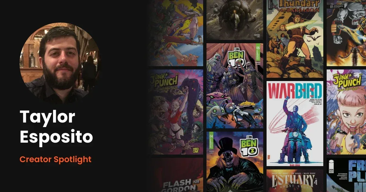
Creator Spotlight: Taylor Esposito on Lettering Junk Punch
Taylor Esposito is a comic book letterer and the owner of Ghost Glyph Studios. He was on staff at DC, his letters run through Red Hood and the Outlaws and Constantine, and he teaches lettering at the Kubert School. This year his work includes Junk Punch, Paul Tobin and Carlos Javier Olivares's five-issue series from Mad Cave.
We asked him what Junk Punch asked of him, how he handles a book when the art changes hands, what his Kubert students get wrong first, and the question about lettering he wishes people asked.
For readers who might not know your work yet, how would you describe what you do?

My job is to not only get the lettering elements (word balloons, sfx, titles and credits, other typographical design elements) on the page, but also help to guide the story along. Lettering does a lot of "invisible" heavy lifting with storytelling, setting the pace and tone for what you are reading. With lettering we can give you a sense of being rushed, or a slow burn, depending on how the page is lettered. We are the final line between a pleasant reading experience or an indecipherable mess, haha.
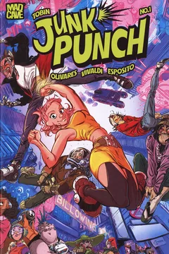
Junk Punch is a five-issue series from Paul Tobin and Carlos Javier Olivares at Mad Cave, with Vol. 1 collecting it in December. What did this book ask of you as a letterer that your other books this year didn't?
I mean, all books do ask for something different from me, whether overtly or via subtext. In this case, Paul and Carlos' story demanded a sort of manic style to the lettering. If you notice, I have all the strokes slightly off register to help with the idea that this is a hyper manic world.
I was slightly inspired by the idea of that old cartoon Dr. Katz with its Squigglevision as a jumping off point, and that got me to the style you see in the book. Still doing my primary job, of being legible and serving the story, but giving it a bit of a different feel that it needed.
Each issue of Junk Punch has a backup story, drawn by a rotating group of artists including Colleen Coover. When the art changes hands, does your lettering change with it, or do you hold one look across the whole issue?
Because of the fact that I am not lettering all the backups (I'd say I did half of them) and they are only 4 pages each, I made the decision to keep the lettering style.
Part of that goes back to my time on the DC lettering staff, where every book had a particular style, so no matter where you read Batman or his characters, for example, there would still be a visual connection between the books and be a familiar element to tie them all together. I wanted to use the lettering to be that visual tie across the different art styles.
Mad Cave pitches Junk Punch as "a bit Tank Girl and a touch of Rick & Morty." On a book like that, how much can a letterer control where a joke lands on the page?
I mean, no matter what, I do have control about where anything lands on any given page. The thing is, I'm usually trusted to use my professional judgment on things. After the fact, there might be a discussion if we are not all in agreement, it really is part of the lettering process.
That said, Paul and I have a great working relationship over the many projects we've worked on together over the years, and he does usually agree with my calls, so that's always nice when we can be on the same page like that, pun somewhat intended.
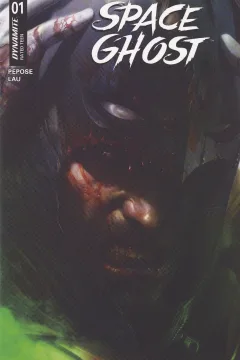
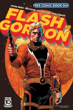
You've said you start every project from scratch, unless it follows a previous series or you're asked to match what came before. Space Ghost and Flash Gordon are characters readers already know. Which side of that line do they fall on for you?
Both were interesting projects. As far as I was concerned with both, they were new books, with new continuities, so I did come up with the styles from scratch. That said, I did want to play up things I saw in the art and the scripts.
With Space Ghost, David Pepose pitched it as Space Batman, so I wanted a strong impactful comic style that also complemented Jonathan Lau's art. I treated that book as if it was Batman, who is a bucket list character I'd like to have a long run on itself. So basically, I thought I'd out Batman Batman as best as I could, given the style of story (more intergalactic, sci fi stuff, but still strong and a bit gritty at times).
With Flash, that was more classic space sci fi, so I made the decision early on to honor the kinds of story that befitted Flash. I was trying to make it a little bit of a classy, sophisticated lettering, especially considering all the art styles that went through the book were like classic, lantern-jawed heroes. You'll notice the letters a little more understated, not as thick and bouncy. That was by design.
You teach lettering at the Kubert School. What's the mistake you see most often the first time a student letters a page?
Honestly, they don't make too many. By the time we actually get to letter pages, we've studied countless pages of lettering, discussed the dos and don'ts of lettering a page, and have tried to work out all the bad habits from their work before we even get to a page of story.
Most of the issues really come from dealing with pages that do not cooperate with best lettering practices. I intentionally give them, at least early on, pages that demand creative thinking and problem solving so they need to find an acceptable solution to the difficult pages. It builds up their ability to work out problems before even tackling the pages.
You run your own studio, Ghost Glyph Studios. What part of running it did nobody warn you about?
How time consuming it is. Freelance is a tough job with no defined end, so it's important to learn when to stop and say "to be continued…tomorrow". To be fair, I was warned, I just didn't think it would be as hard as it was. It's a learning curve we all need to take on firsthand.
You studied graphic design in college and have talked about your love of typography. What from that world do you still use every day that comics people might not expect?
I mean, I look at everything through a typographical lens. I'm that guy that you go out with and I talk about the fonts I see that I like, the mistakes I see out in the world and how much they bother me and I want to fix them. And when I see things that fascinate or impress me in the wild, I take pictures for future reference. Never know when something could be useful.
What are you reading right now, comics or otherwise?
Right now, between my workload and teaching, I don't have much time to read, but I am excited to start on my pal Karl Slominski's original graphic novel The Last Watchtower when I get the chance to sit and read. If you haven't seen any of the art for the book, check it out and pick up a copy.
Do you have a local comic shop? What does that relationship look like for someone who works on as many books as you do?
Not a regular one, per se, but I frequent East Side Mags in Montclair, NJ, as I've known Jeff there for over 10 years at this point, and Dewey's Comic City in Madison, NJ, because of its close association with the Kubert School.
That relationship comes down to the same conversation: "Taylor, what books AREN'T you working on." Apparently most people have at least one of my books in their pull boxes. I was recently asked what I've worked on and joked that it's easier to tell you what I haven't worked on since it's a shorter list. haha
What's a question about lettering you wish people asked instead of the one they always ask?
Frankly, I just wished they asked about it more, period. I see too many people praising things that aren't really effective lettering, but are just flashy, that don't actually contribute to the story (in fact, I think sometimes it may even hurt the storytelling).
My philosophy with lettering (and all parts of making comics) is that we are all working in service to the story. The second we try to elevate ourselves over the storytelling, we are hurting that experience. Of course, I'm not saying we can't do our best work or show off, but it needs to help the story, not pull attention away from it. It's a team sport, as it were, so no one thing should be elevated above the rest.
What are you working on next that you can talk about?
Oof, I'm not even sure. I know there are a few new series at Dynamite coming soon from me, I don't know if they are announced yet, but I'll tell you the truth, it's out there. ::wink wink:: Some new Mad Cave and Bad Idea stuff is on the horizon. I'm sure there are others, I just can't keep track of it all.
Sometimes I am like "I did this book?" and it's not that I forgot from not caring, it's just that from the time the work is done and then ultimately released, I've done so much other work it's slipped my mind. Best thing I can say is keep an eye on the socials, I ultimately post it all there.
Connect with Taylor
Thanks to Taylor for the time.
About the author
Hey, I'm Michael! As the creator and developer behind VerseDB, I get to combine my love for building software with a serious comic book habit. While I enjoy collecting, I'm ultimately in it for the stories they tell. For me, it's all about getting lost in a great narrative and appreciating the artwork. I built this platform to give readers and collectors a clean, organized place to catalog the issues, runs, and art that mean the most to them. Log your favorites and welcome to the community!
Start tracking your collection
Track what you own and follow the series you read.
See what other collectors are picking up.